IES Blog

Institute of Education Sciences

New 2019 Reading and Mathematics Assessment Data on 4th- and 8th-Grade Students

The average reading score for U.S. 4th- and 8th-grade students decreased between 2017 and 2019. Changes in mathematics scores were mixed during this period, with an increase at grade 4 and a decrease at grade 8. These data are from the National Assessment of Educational Progress (NAEP)—also known as The Nation’s Report Card. NAEP is the largest nationally representative and continuing assessment of what students in the United States know and can do in various subject areas and is frequently referred to as the “gold standard” of student assessments.

In 4th-grade reading, the average scale score in 2019 was 220, one point lower than in 2017 (figure 1). In 8th-grade reading, the average scale score was 263, three points lower than in 2017 (figure 2). Compared with a decade ago in 2009, the 2019 average reading scale scores at each grade were not significantly different, but they were higher than the scale scores in 1992, the first time the reading assessment was administered.


Figure 1. Average National Assessment of Educational Progress (NAEP) reading scale scores of 4th-grade students: Selected years, 1992–2019

* Significantly different (p < .05) from 2019

--- Accommodations not permitted

— Accommodations permitted


Figure 2. Average National Assessment of Educational Progress (NAEP) reading scale scores of 8th-grade students: Selected years, 1992–2019

* Significantly different (p < .05) from 2019

--- Accommodations not permitted

— Accommodations permitted


In 4th-grade mathematics, the average scale score in 2019 was 241, one point higher than in 2017 (figure 3). In 8th-grade mathematics, the average scale score in 2019 was 282, one point lower than in 2017 (figure 4). Like reading, average scale scores for mathematics at both grades in 2019 were not significantly different than in 2009. Mathematics scale scores for both grade were higher in 2019 than in 1990, the first time the mathematics assessments were administered.


Figure 3. Average National Assessment of Educational Progress (NAEP) mathematics scale scores of 4th-grade students: Selected years, 1990–2019

* Significantly different (p < .05) from 2019

--- Accommodations not permitted

— Accommodations permitted


Figure 4. Average National Assessment of Educational Progress (NAEP) mathematics scale scores of 8th-grade students: Selected years, 1990–2019

* Significantly different (p < .05) from 2019

--- Accommodations not permitted

— Accommodations permitted


The Nation’s Report Card also presents data by different demographic groups—such as race/ethnicity—gender, school type, and region. White and Black 4th- and 8th-grade students scored lower in reading in 2019 than in 2017. Hispanic and American Indian/Alaska Native 8th-grade students also scored lower in reading in 2019 than in 2017. In mathematics, 4th-grade Hispanic students scored higher in 2019 than in 2017, and 8th-grade American Indian/Alaska Native students scored lower in 2019 than in 2017. From 2017 to 2019, males’ scores increased in mathematics at grade 4 but decreased in reading at both grades.

NCES administered the 2019 NAEP mathematics and reading assessments to almost 600,000 4th- and 8th-graders in public and private schools in all 50 states, the District of Columbia, the U.S. Department of Defense schools, and 27 urban districts. Samples of schools and students are drawn from each state and from the District of Columbia and Department of Defense schools.

Visit https://nces.ed.gov/nationsreportcard/ to view the report.

Cost Considered “Very Important” to Parents Who Chose Relatives as Caregivers for Young Children

When it comes to choosing a child care arrangement, cost is a big factor in the choices parents make, according to recently released data from the National Center for Education Statistics (NCES).

Every 3 years, NCES conducts the Early Childhood Program Participation (ECPP) component of the National Household Education Surveys Program (NHES) to answer questions about young children’s care and education before starting kindergarten. The ECPP survey reported that 60 percent of children under age 5 who were not yet in kindergarten participated in at least one weekly nonparental care arrangement in 2016. Of those receiving nonparental care,

  • 42 percent received only center-based care;
  • 25 percent received only relative care;
  • 20 percent received multiple types of care; and
  • 12 percent received only nonrelative care.

When asked what factors influenced their choice of child care arrangements, 51 percent of parents ranked the cost as “very important” when selecting an arrangement in 2016. This percentage was higher among parents of children in relative care (63 percent) than among parents of children in multiple types of care arrangements (50 percent) and parents of children only in center-based care (47 percent).

Overall, in 2016, some 39 percent of parents with children in nonparental care reported that they had difficulty finding child care. This rate was lowest for parents of children only in relative care (23 percent) and highest for parents of children only in nonrelative care (53 percent). However, among parents who had difficulty trying to find child care, cost was a larger concern for those with children only in relative care than it was for those with children in other arrangements (see figure 1).


Figure 1. Percentage of children under age 5 whose parents reported that cost was the primary reason for difficulty finding child care arrangements, by type of arrangement: 2016

NOTE: Data are for children participating in at least one weekly nonparental care arrangement. Excludes children enrolled in kindergarten.

SOURCE: U.S. Department of Education, National Center for Education Statistics, The Costs of Child Care: Results From the 2016 Early Childhood Program Participation Survey (ECPP-NHES:2016).


In 2016, fees were less common and costs were generally lower for parents with children in relative care than for parents with children in other types of nonparental care arrangements. Thirty-two percent of parents with children in at least one care arrangement were not charged fees for care, and 58 percent of those children were in relative care. Among children in relative care, 80 percent were cared for by grandparents. When parents paid grandparents for their children’s care, they paid an average of $4.86 per hour, less than the average across all types of care arrangements ($6.93 per hour).

For more detailed information about costs of child care, see The Costs of Child Care: Results From the 2016 Early Childhood Program Participation Survey (ECPP-NHES:2016).


By Tracae McClure and Sarah Grady

New Data Support Connection Between Hate-Related Words, Fear, Avoidance, and Absenteeism

Research shows that absenteeism is related to a number of negative outcomes for students, such as lower test scores and higher dropout rates, and often occurs when students feel unsafe, especially for those who experience hate-related harassment. Victims of prejudice or discrimination, including those who are called hate-related words, also experience poorer mental health and higher substance use compared with students who experience other types of harassment (Baams, Talamage, and Russell 2017).

The School Crime Supplement (SCS) defines hate-related words as insulting or bad names having to do with the victim’s race, religion, ethnic background or national origin, disability, gender, or sexual orientation. According to the 2017 SCS, 6 percent of students overall were called a hate-related word while at school. Of students who reported being called a hate-related word, a lower percentage of White students (26 percent) reported that the hate-related word was related to their race than did students who were Black (68 percent), Hispanic (52 percent), Asian (85 percent), and of All other races (64 percent). Additionally, female students were more likely than male students to be called a hate-related word related to their gender (23 vs. 7 percent).

In the 2017 SCS, students who were called a hate-related word felt more fear, practiced more avoidance behaviors, stayed home more from school due to fear, and generally skipped classes more than students who were not called a hate-related word. Specifically, of those students who were called a hate-related word at school,

  • 14 percent did not feel safe at school (compared with 2 percent of students who were not called a hate-related word);
  • 18 percent were afraid that someone would attack or harm them on school property (compared with 3 percent of students who were not called a hate-related word);
  • 27 percent avoided some location, class, or activity at school (compared with 5 percent of students who were not called a hate-related word);
  • 8 percent stayed home from school due to fear that someone would attack or harm them (compared with 1 percent of students who were not called a hate-related word); and
  • 11 percent had skipped class sometime in the previous 4 weeks (compared with 5 percent of students who were not called a hate-related word).
     

Figure 1. Percentage of students ages 12 through 18 who reported being called a hate-related word at school, by student reports of fears and avoidance behaviors: School year 2016–17

1 Those who responded “disagree” or “strongly disagree” to the following question: “Thinking about your school, would you strongly agree, agree, disagree, or strongly disagree with the following? You feel safe in your school.”

2 Those who responded “sometimes” or “most of the time” to the following question: “How often are you afraid that someone will attack or harm you in the school building or on school property?”

3 Those who responded “yes” to one of the following questions: “During this school year, did you ever stay away from any of the following places: shortest route to school; the entrance into the school; any hallways or stairs in school; parts of the school cafeteria or lunchroom; any school restrooms; other places inside the school building; school parking lot; other places on school grounds; school bus or bus stop?”; “Did you avoid any activities at your school because you thought someone might attack or harm you?”; or “Did you avoid any classes because you thought someone might attack or harm you?”

4 Those who responded “yes” to the following question: “Did you stay home from school because you thought someone might attack or harm you in the school building, on school property, on a school bus, or going to or from school?”

NOTE: Figure data include only students who reported being enrolled in grades 6 through 12 and who did not receive any of their education through homeschooling during the school year reported. Students responded to the following question: “During this school year, has anyone called you an insulting or bad name at school having to do with your race, religion, ethnic background or national origin, disability, gender, or sexual orientation? We call these hate-related words.” Population size based on the 2017 SCS for all students meeting the age, grade, and school criteria is 25,023,000.

SOURCE: U.S. Department of Justice, Bureau of Justice Statistics, School Crime Supplement (SCS) to the National Crime Victimization Survey, 2017. See Table 16 in the crime table library.


You can find more information on student-reported experiences related to school crime and safety in NCES publications, including Student Reports of Bullying: Results From the 2017 School Crime Supplement to the National Crime Victimization Survey and the 2018 Indicators of School Crime and Safety.


By Christina Yanez and Rebecca Mann, Synergy Enterprises, Inc., and Rachel Hansen, NCES


Reference

Baams, L., Talmage, C., and Russell, S. (2017). Economic Costs of Bias-Based Bullying. School Psychology Quarterly, 32(3): 422–433.

New Report on School Choice in the United States

Across the United States, parents have an increasing number of educational options for their children, including traditional public schools, public charter schools, private schools, and homeschooling. Although the majority of students attend traditional public schools, the numbers of students attending public charter schools or homeschool programs are growing, according to recently released data.

Using survey data from the National Center for Education Statistics (NCES), the newly released School Choice in the United States: 2019 report provides information on student enrollment; individual, family, and school characteristics of students enrolled in different educational settings; achievement; school crime and safety; and differences in the school choice options that parents select and their satisfaction with their children’s school.


School Enrollment Trends

Over time, the numbers of students enrolled in traditional public schools, public charter schools, and homeschool programs have increased (see figure 1). Enrollment in traditional public schools was 1 percent higher in fall 2016 (47.3 million) than in fall 2000 (46.6 million). 

Public charter schools grew at a much more rapid rate in that time, with enrollment increasing by more than 500 percent, from 0.4 million in fall 2000 to 3.0 million in fall 2016. Enrollment in homeschool programs has also grown, nearly doubling from 1999 (0.9 million) to 2016 (1.7 million). However, private school enrollment fell 4 percent between fall 1999 and fall 2015.


Figure 1. Enrollment in traditional public schools, public charter schools, private schools, and homeschooling

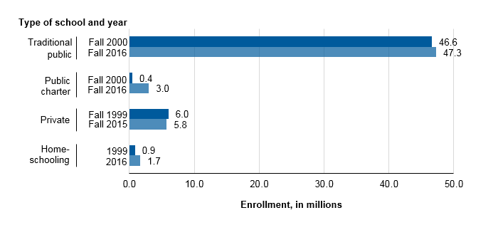
SOURCE: U.S. Department of Education, National Center for Education Statistics, Common Core of Data (CCD), “Public Elementary/Secondary School Universe Survey,” 2000–01 and 2016–17; Private School Universe Survey (PSS), 1999–2000 and 2015–16; Parent Survey and Parent and Family Involvement in Education Survey of the National Household Education Surveys Program (Parent-NHES:1999 and PFI-NHES:2016).


Student and School Characteristics

This report also explores enrollment in different school options across a range of characteristics, including students’ racial/ethnic background (see figure 2), family composition, household poverty status, parent education and employment, and more.

For example, public schools enrolled higher percentages of Black and Hispanic students than did private schools in fall 2015. Within the public school sector, public charter schools enrolled higher percentages of Black and Hispanic students and lower percentages of White and Asian/Pacific Islander students than did traditional public schools in fall 2016. And, the percentages of students who were homeschooled in 2016 were higher for White and Hispanic students than for Black and Asian students.


Figure 2. Percentage distribution of elementary and secondary enrollment, by school type and student race/ethnicity: 2015 and 2016
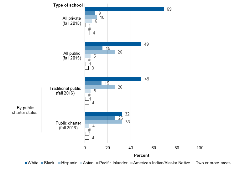
 

#Rounds to zero.
NOTE: Figure excludes homeschooled children. Race categories exclude persons of Hispanic ethnicity. Although rounded numbers are displayed, the figures are based on unrounded data. Detail may not sum to totals because of rounding.
SOURCE: U.S. Department of Education, National Center for Education Statistics, Private School Universe Survey (PSS), 2015–16; and Common Core of Data (CCD), "Public Elementary/Secondary School Universe Survey," 2016–17.


In 2016, about 58 percent of public charter school students were enrolled in schools in cities, compared with 29 percent of traditional public school students; traditional public school students were more likely than public charter school students to attend schools in suburban areas, towns, and rural areas.

In 2015, about 43 percent of private school students were enrolled in schools in cities, and 40 percent were enrolled in schools in suburban areas. However, homeschooling in 2016 was more prevalent among students in rural areas than among those in cities and suburban areas.


Parental Choice

In 2016, parents whose children were enrolled in public or private schools were asked about their decisions regarding school choice. Twenty-eight percent of students had parents who reported that they had considered schools other than the one in which their children were currently enrolled, and 80 percent had parents who reported that their children’s current school was their first choice. Among public school students, 20 percent had parents who reported they moved to their current neighborhood so their children could attend their current public school.

Each of these percentages was higher for students from nonpoor households than for students from near-poor or poor households (see figure 3). For example, 31 percent of students in nonpoor households had parents who reported that they considered other schools for their children, compared with 23 percent of students in near-poor households and 21 percent of students in poor households.


Figure 3. Percentage of students enrolled in grades 1 through 12 whose parents considered other schools, reported current school was their first choice, or moved to their current neighborhood for the public school, by family poverty status: 2016

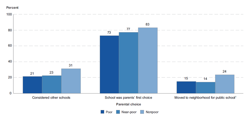
1 Includes public school students only. Private school students are excluded.
NOTE: Data exclude homeschooled children.
SOURCE: U.S. Department of Education, National Center for Education Statistics, Parent and Family Involvement Survey of the National Household Education Surveys Program (PFI-NCES:2016).


Browse the full School Choice in the United States: 2019 report to learn more about these and other trends related to school choice and student enrollment.


By Amy Rathbun and Ke Wang, AIR

Education at a Glance 2019: Putting U.S. Data in a Global Context

International comparisons provide reference points for researchers and policy analysts to understand trends and patterns in national education data and are important as U.S. students compete in an increasingly global economy.

Education at a Glance, an annual publication produced by the Organisation for Economic Co-operation and Development (OECD), provides data on the structure, finances, and progress of education systems in 36 OECD countries, including the United States, as well as a number of OECD partner countries. The report also includes state-level information on key benchmarks to inform state and local policies on global competitiveness. 

The recently released 2019 edition of the report shows that the United States is above the international average on some measures, such as participation in and funding of higher education, but lags behind in others, such as participation in early childhood education programs.


Distribution of 25- to 34-Year-Olds With a College Education, by Level of Education

The percentage of U.S. 25- to 34-year-olds with an associate’s or bachelor’s degree increased by 8 percentage points between 2008 and 2018, reaching 49 percent, compared with the OECD average of 44 percent. However, the attainment rates varied widely across the United States in 2017, from 32 percent for those living in Louisiana and West Virginia to 58 percent for those living in Massachusetts and 73 percent for those living in the District of Columbia.

The percentage of U.S. students completing a bachelor’s degree within 4 years was 38 percent in 2018, about the same as the average among OECD countries with available data (39 percent); however, after an additional 2 years, the U.S. graduation rate (69 percent) was slightly above the OECD average of 67 percent (achieved after 3 years). While a higher percentage of U.S. young adults had completed a bachelor’s degree compared with young adults in other OECD countries, a lower percentage had completed a master’s or doctoral degree. Eleven percent of 25- to 34-year-olds in the United States had completed a master’s or doctoral degree, compared with an average of 15 percent across OECD countries.


Higher Education Spending

U.S. spending on higher education is also relatively high compared with the OECD average, in both absolute and relative terms. The United States spent $30,165 per higher education student in 2017, the second-highest amount after Luxembourg and nearly double the OECD average ($15,556). Also, U.S. spending on higher education as a percentage of GDP (2.5 percent) was substantially higher than the OECD average (1.5 percent). These total expenditures include amounts received from governments, students, and all other sources. 


Early Childhood Education

Contrasting with enrollment patterns at the higher education level, the level of participation in early childhood education programs in the United States is below the OECD average and falling further behind. Between 2005 and 2017, average enrollment rates for 3- to 5-year-olds across OECD countries increased from 76 to 86 percent. In contrast, the rate in the United States remained stable at 66 percent during this time period. Among U.S. states, the 2017 enrollment rates for 3- to 5-year-olds ranged from less than 50 percent in Idaho, North Dakota, and Wyoming to more than 70 percent in Connecticut, the District of Columbia, and New Jersey.

Going deeper into the data, on average, 88 percent of 4-year-olds in OECD countries were enrolled in education programs in 2017, compared with 66 percent in the United States. The enrollment rate for 3-year-olds in the United States was 42 percent, compared with the OECD average of 77 percent.


Gender Gaps in Employment

Education at a Glance also looks at employment and other outcomes from education. The report found that the 2017 gender gap in employment rates was lower for those who had completed higher levels of education. This pattern holds in the United States, where the gender gap in the employment rate was particularly high among 25- to 34-year-olds who had not completed high school. For this age group, the employment rate was 73 percent for men and 41 percent for women, a difference of 32 percentage points, compared with the average difference of 28 percentage points across OECD countries. The gender gap in the employment rate was 14 percentage points among U.S. adults with only a high school education and 7 percentage points among those who had completed college.

In 2017, the gender differences in average earnings were also wider in the United States than in the OECD averages. These gender gaps in earnings between male and female full-time workers existed across all levels of education. In the United States, college-educated 25- to 64-year-old women earned 71 percent of what their male peers earned. This gender gap was wider than for all other OECD countries except for Chile, the Czech Republic, Hungary, Israel, Italy, Mexico, Poland, and the Slovak Republic.

This is just a sample of the information that can be found in Education at a Glance 2019. You can also find information on the working conditions of teachers, including time spent in the classroom and salary data; student/teacher ratios; college tuitions and loans; and education finance and per student expenditures. Education at a Glance also contains data on the international United Nations Sustainable Development Goals related to education.

Browse the full report to see how the United States compares with other countries on these important education-related topics.


Percentage of 25- to 34-year-olds with a college education, by level of education: 2018

1 Year of reference differs from 2018 (see NOTE).                                                                                                                                       

NOTE: Reporting of some countries is not consistent with international categories. Please refer to Education at a Glance Database, http://stats.oecd.org. for details. Comparisons follow International Standard Classification of Education (ISCED) 2011 education levels: “Associate’s or similar degrees” refers to ISCED 2011 level 5, “Bachelor’s or equivalent” refers to level 6, “Master’s or equivalent” refers to level 7, and “Doctoral or equivalent” refers to level 8. Countries are ranked in descending order of the total percentage of tertiary-educated 25- to 34-year-olds. See Annex 3 for additional notes (https://doi.org/10.1787/f8d7880d-en).

SOURCE: Organisation for Economic Co-operation and Development (2019), Education at a Glance Database, http://stats.oecd.org


By Thomas Snyder