NCES Blog

National Center for Education Statistics

A Slightly More Diverse Public School Teaching Workforce

There is research evidence that having a teacher of the same race/ethnicity can have positive impacts on a student’s attitudes, motivation, and achievement[1] and that minority teachers may have more positive expectations for minority students’ achievement than nonminority teachers.[2] New data from the National Center for Education Statistics show that the public school teaching workforce is becoming more diverse, but is still predominantly White.

The majority of public elementary and secondary school teachers were White in both 2003–04 and 2015–16. However, the percentage of teachers who were White was lower in 2015–16 than in 2003–04 (80 vs. 83 percent). While the percentage of teachers who were Black also fell slightly in that time, the percentages of teachers who were Hispanic, Asian, and of Two or more races were higher in 2015–16 than in 2003–04.


Figure 1. Percentage distribution of teachers in public elementary and secondary schools, by race/ethnicity: School years 2003–04 and 2015–16


# Rounds to zero.
NOTE: Data are based on a head count of full-time and part-time teachers. Race categories exclude persons of Hispanic ethnicity. Detail may not sum to totals because of rounding. Although rounded numbers are shown, figures are based on unrounded estimates.
SOURCE: U.S. Department of Education, National Center for Education Statistics, Schools and Staffing Survey (SASS), “Public School Teacher Data File,” 2003–04; and National Teacher and Principal Survey (NTPS), “Public School Teacher Data File,” 2015–16. See Digest of Education Statistics 2017, table 209.10.


The racial/ethnic diversity of teachers differed somewhat by school characteristics. For example, schools with more racial/ethnic diversity in their student populations also tended to have more racial/ethnic diversity among teachers. In 2015–16, the percentage of minority[3] teachers was highest at schools that had 90 percent or more minority students (55 percent) and was lowest at schools with less than 10 percent minority students (2 percent). The opposite pattern was observed for White teachers, who accounted for 98 percent of teachers at schools with less than 10 percent minority students but made up only 45 percent of staff at schools with 90 percent or more minority students.


Figure 2. Percentage distribution of teachers in public elementary and secondary schools, by percentage of minority students in school and teacher minority status: School year 2015–16


NOTE: Excludes the 7 percent of teachers for whom the percentage of minority enrollment in the school was not available. Minority teachers include all racial/ethnic groups except for White. Race categories exclude persons of Hispanic ethnicity. Detail may not sum to totals because of rounding.
SOURCE: U.S. Department of Education, National Center for Education Statistics, National Teacher and Principal Survey (NTPS), “Public School Teacher Data File,” 2015–16. See Digest of Education Statistics 2017, table 209.23.


Are you interested in other differences in teacher characteristics by race/ethnicity? Then check out the spotlight feature in the Status and Trends in the Education of Racial and Ethnic Groups 2018 report.


By Lauren Musu


[1] Egalite, A.J., and Kisida, B. (2018). The Effects of Teacher Match on Students’ Academic Perceptions and Attitudes. Educational Evaluation and Policy Analysis, 40(1): 59–81; Egalite, A.J., Kisida, B., and Winters, M.A. (2015). Representation in the Classroom: The Effect of Own-Race Teachers on Student Achievement. Economics of Education Review, 45, 44–52.

[2] Gershenson, S., Holt, S.B., and Papageorge, N.W. (2016). Who Believes in Me? The Effect of Student-Teacher Demographic Match on Teacher Expectations. Economics of Education Review, 52, 209–224.

[3] Minority teachers include all racial/ethnic groups except for White.

Learning about Schools from Teachers and Principals

In the 2015-16 school year, there were approximately 90,400 principals and 3,827,100 teachers in public elementary and secondary schools in the United States. Knowledge about the characteristics and experiences of these key school staff can help inform decisions about education.  The National Teacher and Principal Survey (NTPS) supports these decisions by providing data on a variety of topics from the perspective of teachers, principals and other school staff. Results from these questionnaires provide information such as:

  • Principals’ education. Among public schools, a majority of principals held a master’s degree (61 percent) as their highest degree, compared to an education specialist/professional diploma at least one year beyond the master’s level (27 percent), a doctorate/first professional degree (10 percent), or a bachelor’s degree or less (2 percent).
  • Hours worked by teachers. On average, regular full-time teachers in public schools spent 53 hours per week on all school-related activities. That includes 27 hours that they were paid to deliver instruction to students during a typical full week. Public school teachers were required to work an average of 38 hours per week to receive their base pay.
  • Online courses. Nationwide, about 21 percent of public schools offered at least one course entirely online. This was more common among public charter schools (29 percent) than it was among traditional public schools (20 percent). A greater percentage of high (58 percent) and combined (64 percent) schools offered one or more courses entirely online than all public schools. It was also more common for schools with fewer than 100 students (45 percent) and schools with 1,000 or more students (44 percent). Among schools offering online courses, relatively more public charter schools offered all of their classes online (14 percent) than traditional public schools (5 percent).

More examples of the type of information collected in the 2015-16 NTPS can be seen in the video below:

More information is available in the NTPS online table library. In addition, analysts can access the data using DataLab or obtain a restricted-use license to conduct their own analyses of NTPS restricted-use data files.


By Maura Spiegelman

Back to School by the Numbers: 2018

Across the country, hallways and classrooms are full of activity as students head back to school for the 2018–19 academic year. Each year, the National Center for Education Statistics (NCES) compiles some back-to-school facts and figures that give a snapshot of our schools and colleges for the coming year. You can see the full report on the NCES website, but here are a few “by-the-numbers” highlights. You can also click on the hyperlinks throughout the blog to see additional data on these topics.

The staff of NCES and the Institute of Education Sciences hopes our nation’s students, teachers, administrators, school staffs, and families have an outstanding school year!


50.7 million

The number of students expected to attend public elementary and secondary schools this year—slightly more than in the 2017–18­ school year (50.6 million). The racial and ethnic profile of these students includes 24.1 million White students, 7.8 million Black students, 14.0 million Hispanic students, 2.6 million Asian students, 0.2 million Pacific Islander students, 0.5 million American Indian/Alaska Native students, and 1.6 million students of Two or more races.

About 5.9 million students are expected to attend private schools this year.


16.0

The expected number of public school students per teacher in fall 2018. This ratio has remained consistent at around 16.0 since 2010. However, the pupil/teacher ratio is lower in private schools (12.3) and has fallen since 2010, when it was 13.0. 


$12,910

This is the projected per-student expenditure in public elementary and secondary schools in 2018–19. Total expenditures for public elementary and secondary schools are projected to be $654 billion for the 2018–19 school year.


3.6 million

The number of students expected to graduate from high school this academic year, including about 3.3 million from public schools and nearly 0.4 million from private schools.


19.9 million

This is the number of students expected to attend American colleges and universities this fall—higher than the fall 2000 enrollment of 15.3 million but lower than the peak of 21.0 million in 2010. About 13.3 million students will attend four-year institutions and 6.7 million will attend two-year institutions.


56.5%

The projected percentage of female postsecondary students in fall 2018, for a total of about 11.2 million female students, compared with 8.7 million male students.


By Lauren Musu, NCES and Molly Fenster, American Institutes for Research

A Closer Look at Teacher Income

Full-time teachers in public school earned an average of $59,050 from all income sources in the 2015–16 school year. This income includes teachers’ base teaching salary, as well as additional sources of income from their schools or districts, jobs outside the school system, and summer activities. To capture the different ways that teachers can earn income, the 2015-16 National Teacher and Principal Survey asked teachers questions about how much they earned from various sources:

  • Base teaching salary. Teachers’ average base teaching salary was $55,120 for the 2015-16 school year.
  • School supplement. About 44 percent of teachers received additional compensation for extracurricular or additional activities in their school system, such as coaching, sponsoring student activities, mentoring teachers, or teaching evening classes. These teachers earned an average of $2,630 for these activities.
  • Merit pay. Some teachers earned merit pay or pay-for-performance income based on their students’ performance. About 6 percent of teachers received this type of additional compensation, with an average amount awarded of $1,470.
  • Other school system support. About 8 percent of teachers received income during the school year from some other source in their school system, such as a state supplement, for an average of $2,670.
  • Outside jobs. During the 2015-16 school year, 18 percent of teachers held a job outside the school system, earning an average of $5,140. Teachers categorized these jobs as teaching or tutoring (5 percent), non-teaching but related to the teaching field (4 percent), or in another field (9 percent).
  • Summer jobs. In the summer of 2015, before the start of the 2015-16 school year, 20 percent of teachers earned income from either a school-based teaching position, such as teaching summer school, or a non-teaching position, and 16 percent earned income from a non-school job. Teachers earned an average of $2,700 from school-based summer positions, and an average of $4,060 in a non-school job.

To learn about teachers’ satisfaction with their teaching salary, more information is available in the short report Teacher Satisfaction with Salary and Current Job.

The National Teacher and Principal Survey (NTPS) includes data on a wide variety of other topics as well. Visit the website to learn more.

By Maura Spiegelman

Announcing the Condition of Education 2018 Release

We are pleased to present The Condition of Education 2018, a congressionally mandated annual report summarizing the latest data on education in the United States. This report is designed to help policymakers and the public monitor educational progress. This year’s report includes 47 indicators on topics ranging from prekindergarten through postsecondary education, as well as labor force outcomes and international comparisons. 

In addition to the regularly updated annual indicators, this year’s spotlight indicators highlight new findings from recent NCES surveys. The first spotlight indicator examines the choices and costs that families face as they select early childhood care arrangements. Drawing on data from the NCES National Household Education Survey, the indicator finds that early childhood care expenses were higher in 2016 than in 2001. For example, families’ average hourly out-of-pocket expenses for center-based care were 72 percent higher in 2016 ($7.60) than in 2001 ($4.42), in constant 2016–17 dollars. The indicator also finds that in 2016, some 57 percent of children under the age of 6 had parents who reported there were good choices for child care where they lived. Among children whose parents reported difficulty finding child care in 2016, some 32 percent cited cost as the primary reason. The complete indicator, Early Childhood Care Arrangements: Choices and Costs, contains more information about how these findings varied by family income, race/ethnicity, locale (urban, suburban, town, or rural), and children’s age.


Average hourly out-of-pocket child care expense for children under 6 years old and not yet in kindergarten whose families paid for child care, by primary type of child care arrangement: 2001 and 2016

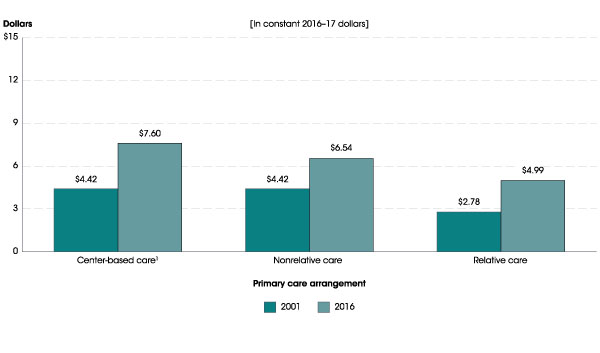
1 Center-based arrangements include day care centers, Head Start programs, preschools, prekindergartens, and childhood programs.
NOTE: Estimates include only those children whose families paid at least part of the cost out of pocket for their child to receive nonparental care at least weekly.
SOURCE: U.S. Department of Education, National Center for Education Statistics, Early Childhood Program Participation Survey of the National Household Education Surveys Program (ECPP-NHES: 2001 and 2016). See Digest of Education Statistics 2017, table 202.30c.


The second spotlight describes the characteristics of teachers who entered the teaching profession through an alternative route to certification program. Compared to those who entered through a traditional route, higher percentages of alternative route teachers in 2015–16 were Black (13 vs. 5 percent), Hispanic (15 vs. 8 percent), of Two or more races (2 vs. 1 percent), and male (32 vs. 22 percent), and lower percentages were White (66 vs. 83 percent). Overall, 18 percent of public school teachers in 2015–16 had entered teaching through an alternative route to certification program. The percentages were higher among those who taught career or technical education (37 percent), natural sciences (28 percent), foreign languages (26 percent), English as a second language (24 percent), math and computer science (22 percent), and special education (20 percent). The analysis also examines how the prevalence of alternative route teachers varies between charter schools and traditional public schools, between high and low poverty schools, and between schools that enroll high or low percentages of racial/ethnic minority students. For more findings from this analysis of data from the National Teacher and Principal Survey, see the complete indicator, Characteristics of Public School Teachers Who Completed Alternative Route to Certification Programs.


Percentage distribution of public elementary and secondary school teachers, by route to certification and race/ethnicity: 2015–16

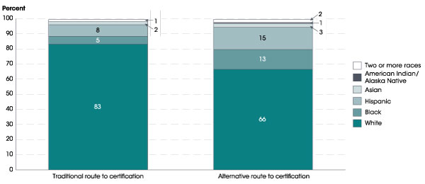
NOTE: Teachers were asked whether they entered teaching through an alternative route to certification program, which is a program that was designed to expedite the transition of nonteachers to a teaching career (for example, a state, district, or university alternative route to certification program). Detail may not sum to totals because of rounding. Race categories exclude persons of Hispanic ethnicity. Data for American Indian/Alaska Native teachers who entered teaching through a traditional route and Pacific Islander teachers who entered teaching through traditional and alternative routes round to zero and are not displayed.
SOURCE: U.S. Department of Education, National Center for Education Statistics, National Teacher and Principal Survey (NTPS), “Public School Teacher Data File,” 2015–16. See Digest of Education Statistics 2017, table 209.24.


The third spotlight presents data on average student loan balances for students completing graduate degrees. Using data from the National Postsecondary Student Aid Study, this indicator examines how average student loan balances changed between 1999–2000 and 2015–16, and how those trends varied by degree type. Among graduate school completers who had student loans for undergraduate or graduate studies, average student loan balances increased for all degree types (in constant 2016–17 dollars). For example, average student loan balances for students who completed research doctorate degrees, such as a Ph.D., doubled during this time period, from $53,500 to $108,400 (an increase of 103 percent). Average student loan balances increased by 90 percent for those who completed professional doctorate degrees, such as medical doctorates and law degrees (from $98,200 to $186,600). The complete indicator, Trends in Student Loan Debt for Graduate School Completers, also describes how average student loan balances varied among specific degree programs, such as medical doctorates, law degrees, and master’s degrees in business administration.


Average cumulative student loan balance for graduate school completers, by degree type: Selected years, 1999–2000 through 2015–16

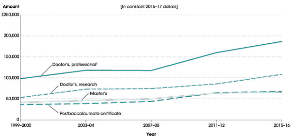
1 Includes chiropractic, dentistry, law, medicine, optometry, pharmacy, podiatry, and veterinary medicine. 
NOTE: Data refer to students who completed graduate degrees in the academic years indicated. Includes student loans for undergraduate and graduate studies. Average excludes students with no student loans.
SOURCE: U.S. Department of Education, National Center for Education Statistics, 1999–2000, 2003–04, 2007–08, 2011–12, and 2015–16 National Postsecondary Student Aid Study (NPSAS:2000, NPSAS:04, NPSAS:08, NPSAS:12, and NPSAS:16). See Digest of Education Statistics 2017, table 332.45.


The Condition includes an At a Glance section, which allows readers to quickly make comparisons within and across indicators, and a Highlights section, which captures key findings from each indicator. The report contains a Reader’s Guide, a Glossary, and a Guide to Sources that provide additional background information. Each indicator provides links to the source data tables used to produce the analyses.

As new data are released throughout the year, indicators will be updated and made available on The Condition of Education website. In addition, NCES produces a wide range of reports and datasets designed to help inform policymakers and the public. For more information on our latest activities and releases, please visit our website or follow us on Twitter, Facebook, and LinkedIn.

By James L. Woodworth, NCES Commissioner