How do we achieve the best education results for the best price? This is a central question among researchers and policymakers alike. In this blog post, we share outcomes from school year 2017–18 concerning public charter school spending at the elementary, middle, and high school levels to help inform the discussion on charter school costs and benefits to the broader education system.
The first modern charter law in the United States was passed in Minnesota in 1991. Since that time, the number of charter schools has grown tremendously as an option in public elementary and secondary education. In 2017–18, the United States had 7,086 public charter schools in 44 states and the District of Columbia. In a decade, from 2007–08 to 2017–18, the number of public charter schools in the United States increased more than 70 percent, representing a little more than 7 percent of all public schools at the end of this time period (figure 1).
Figure 1. Number of public charter schools in the United States: School years 2007–08 through 2017–18
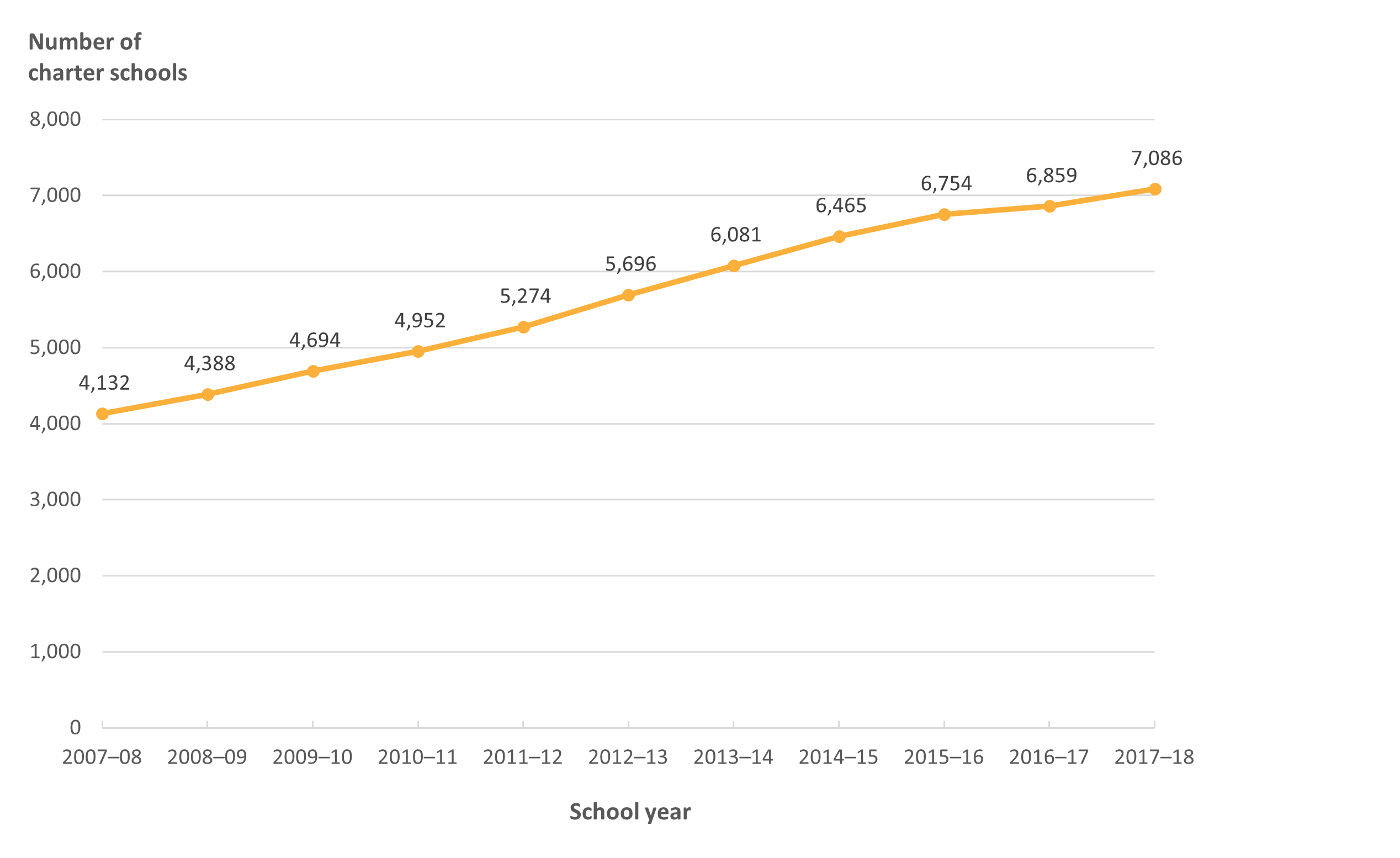
NOTE: These data include counts of operational public elementary/secondary charter schools for the 50 states and the District of Columbia.
SOURCE: U.S. Department of Education, National Center for Education Statistics, Common Core of Data (CCD), 2007–08 through 2017–18.
Nearly half (47 percent) of all public charter schools in the United States are classified as elementary schools, 11 percent are classified as middle schools, and 28 percent are classified as high schools (figure 2). The remainder (14 percent) have other grade-level configurations and do not fall into any of these categories.
Figure 2. Percentage of public charter schools in the United States, by school level: School year 2017–18
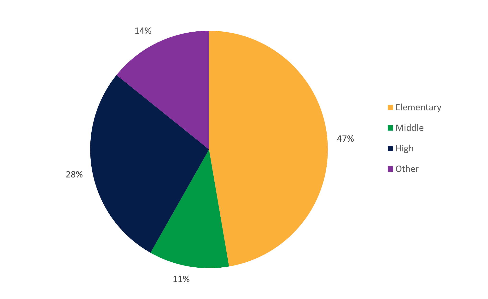
NOTE: These data reflect operational public elementary/secondary charter schools for the 50 states and the District of Columbia from the Common Core of Data (CCD) for 2017. School-level categories are taken from the Documentation to NCES’ Common Core of Data for school year 2017–18, whereby “Elementary” includes schools with students enrolled in grades K–4 that offer more elementary grades than middle grades; “Middle” includes schools with students enrolled in grades 5–8 that offer more middle grades than elementary or secondary grades; “High” includes schools with students enrolled in grade 12 and other secondary grades that offer more high grades than middle grades; and “Other” includes schools with both elementary and high grades or grades at all three levels (elementary, middle, and high). Excludes 2,360 schools categorized in the CCD as adult education, not applicable, not reported, prekindergarten-only, secondary, and ungraded.
SOURCE: U.S. Department of Education, National Center for Education Statistics, Civil Rights Data Collection (CRDC), 2017–18.
According to expenditure data captured in the Civil Rights Data Collection (CRDC), public schools in the United States spent $330.94 billion in 2017–18, or more than $6,600 per pupil. Reports of national school expenditures based on data from the CRDC are significantly lower than those estimated using the National Public Education Financial Survey (NPEFS) from the Common Core of Data (CCD). This could be attributed to data on spending for school nutrition, operations and maintenance, and transportation being captured in the NPEFS but not collected in the CRDC. However, the CRDC data allow for comparisons of public charter and noncharter schools at the school level. In 2017–18, spending among public noncharter schools fell just under the national average of $6,500 per pupil. Like other schools in the U.S. public school system, charter schools do not charge tuition and instead receive district and state funding based on their enrollment. Public charter schools spent more than $26.83 billion in 2017–18, or just more than $8,900 per pupil, thus exceeding the national average.
The per pupil school expenditures of public charter schools across school levels1 are different from those of public noncharter schools. This analysis compares spending between public elementary, middle, and high schools in 2017–18. (Mixed-level and other schools are excluded because they have variable grade levels and other characteristics that can make expenditures incomparable across school types.) Across school levels, per pupil expenditures among public charter schools exceeded the national average, while per pupil expenditures among public noncharter schools were closer to the national average. Specifically, for public charter schools, per pupil expenditures were highest for elementary schools ($8,400), followed by high schools ($8,200) and middle schools ($8,100) (figure 3). However, for public noncharter schools, per pupil expenditures were highest for high schools ($6,600), followed by elementary schools ($6,400) and middle schools ($6,100).
Figure 3. Per pupil public school expenditures, by public charter school status and school level: School year 2017–18
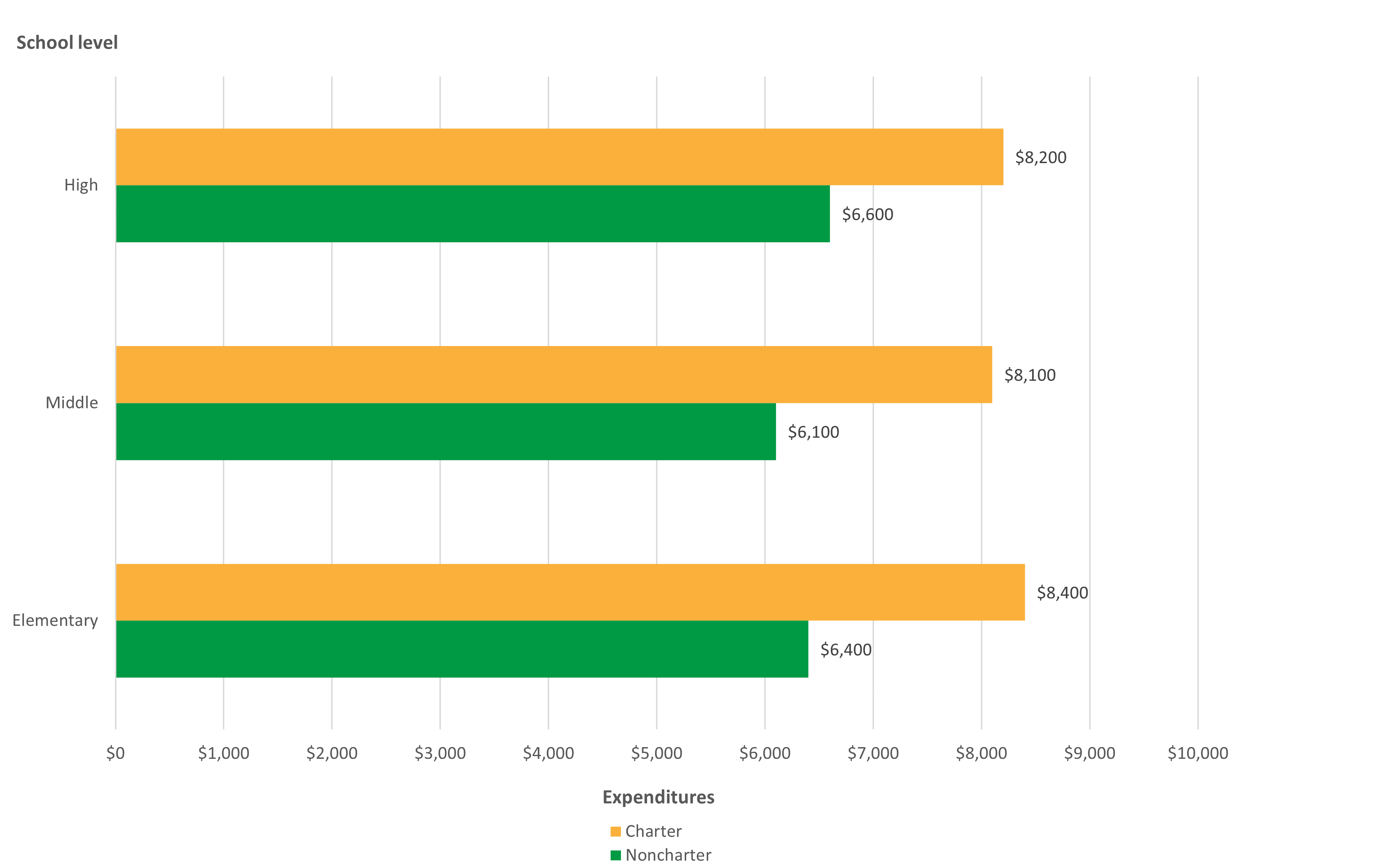
NOTE: Rounded to nearest multiple of 100. Analytical universe restricted to charter schools in both the CRDC and CCD that could be linked or matched using unique identification numbers.
SOURCE: U.S. Department of Education, National Center for Education Statistics, Civil Rights Data Collection (CRDC), 2017–18.
The CRDC splits school expenditures into personnel or staff expenditures (e.g., salaries of teachers and of instructional, support, and administrative staff) and nonpersonnel expenditures (e.g., the cost of books, computers, instructional supplies, and professional development for teachers). (Nonpersonnel expenditures do not include those for school nutrition, operations, maintenance, or transportation to and from school.) Figures 4 and 5 show that across school levels in 2017–18, both public charter and noncharter schools tended to spend more per pupil on salaries and less per pupil on nonpersonnel expenditures. The differences between public charter and noncharter schools are particularly noticeable in comparisons of nonpersonnel expenditures, where charter schools spent considerably more per pupil than noncharter schools, most prominently at the elementary school level ($3,400 vs. $800). The figures also show that among public charter schools, middle schools had higher salary expenditures but lower nonpersonnel expenditures than did elementary or high schools. These findings demonstrate the importance of considering school level when examining public charter school spending.
Figure 4. Per pupil public school salary expenditures, by public charter school status and school level: School year 2017–18
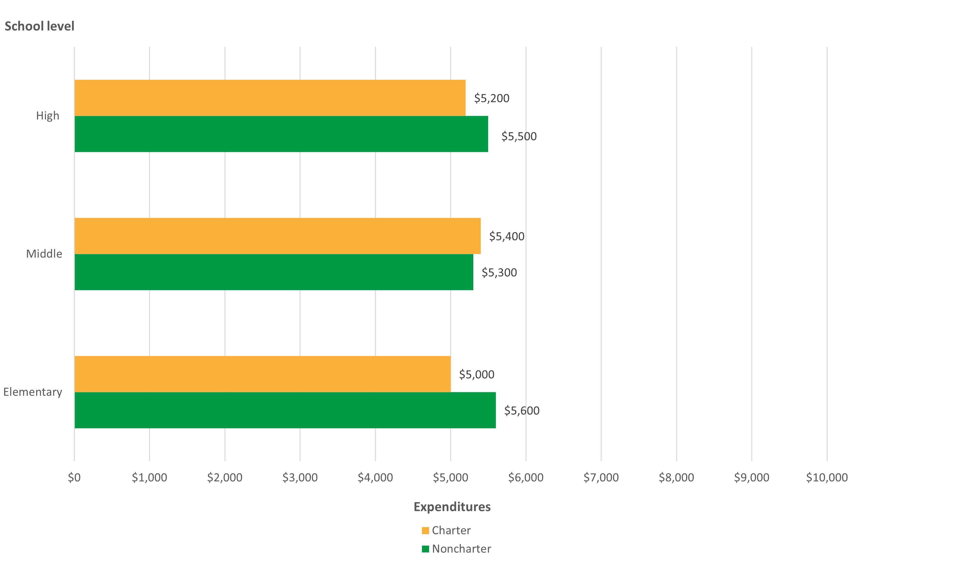
NOTE: Rounded to nearest multiple of 100. Analytical universe restricted to charter schools in both the CRDC and CCD that could be linked or matched using unique identification numbers.
SOURCE: U.S. Department of Education, National Center for Education Statistics, Civil Rights Data Collection (CRDC), 2017–18.
Figure 5. Per pupil public school nonpersonnel expenditures, by public charter school status and school level: School year 2017–18
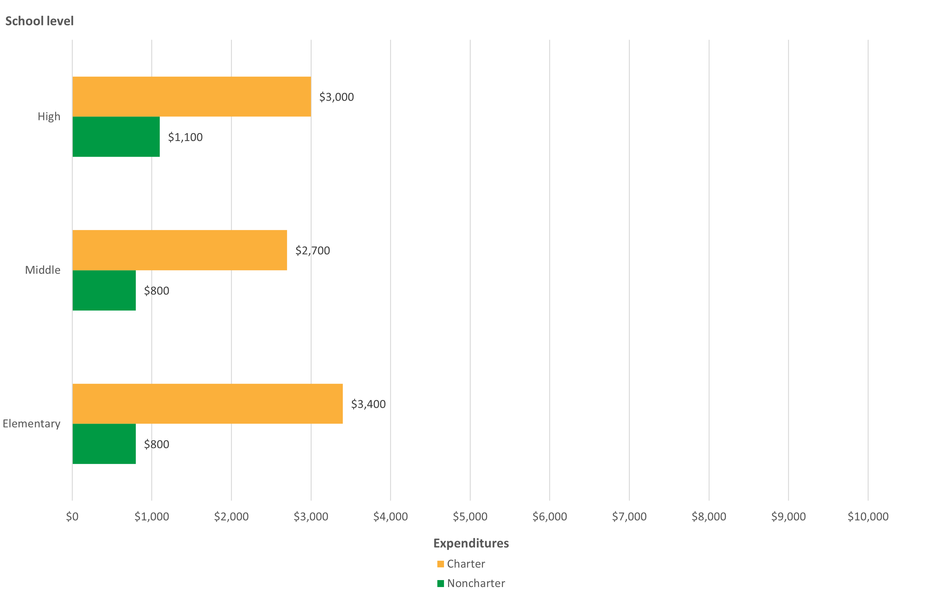
NOTE: Rounded to nearest multiple of 100. Analytical universe restricted to charter schools in both the CRDC and CCD that could be linked or matched using unique identification numbers.
SOURCE: U.S. Department of Education, National Center for Education Statistics, Civil Rights Data Collection (CRDC), 2017–18.
Thoughts for Future Research
Since 2009, the CRDC—a mandatory data collection—has collected school expenditure data from elementary and secondary public schools and school districts. The 2017–18 findings suggest that public charter schools spent nearly 200 to 300 percent more on nonpersonnel expenditures per pupil than did public noncharter schools. However, there are concerns about districts’ ability to accurately report school expenditure data, including those for public charter schools. While the CRDC is currently the only complete national database of school-level spending, the CCD has partial school-level fiscal data for about 30 states, and NCES is making an effort to increase this voluntary reporting. Future studies could include a more targeted analysis of spending among public charter schools by geographic settings, student enrollee characteristics, school size, and school type.
Civil Rights Data Collection
Since 1968, the U.S. Department of Education has collected data on key education and civil rights issues in our nation’s public schools. The CRDC collects a variety of information, including data on student enrollment and educational programs and services, most of which is disaggregated by race/ethnicity, sex, limited English proficiency, and disability. The CRDC informs the Office of Civil Rights’ overall strategy for administering and enforcing the civil rights statutes for which it is responsible. The CRDC collects data only from public schools (i.e., no data are collected from private schools). The CRDC data files can be found here: https://ocrdata.ed.gov/.
By Jennifer Hudson, Ph.D., and Jennifer Sable (AIR) and Christopher D. Hill, Ph.D. (NCES)
[1] For the purposes of this blog post, school-level categories are taken from the Documentation to NCES’ Common Core of Data for SY 2017–18: “Elementary” includes schools with students enrolled in grades K through 4 that offer more elementary grades than middle grades. “Middle” includes schools with students enrolled in grades 5 through 8 that offer more middle grades than elementary or secondary grades. “High” include schools with students enrolled in grade 12 and other secondary grades that offer more high grades than middle grades. “Other” includes schools with both elementary and high grades or grades at all three levels (elementary, middle, and high).